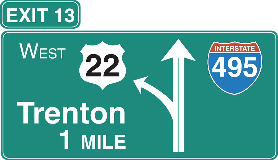
Highways crisscrossing the American landscape are more than just ribbons of asphalt connecting cities and towns. They’re arteries of movement, conduits for adventure, and gateways to exploration. And as you cruise along these asphalt veins, you encounter a familiar sight: green highway signs. But have you ever wondered why these signs consistently sport a verdant hue? Let’s delve into the fascinating history and practical reasons behind this color choice.
The Ubiquitous Green Signage
1. The Landscape Blend:
- According to the Arizona Department of Transportation (ADOT), green was chosen because it’s a “cool” color. But what does that mean? Imagine driving through the heartland, surrounded by lush forests, rolling hills, and expansive plains. Green highway signs blend seamlessly with this natural palette—think of them as the chameleons of the road. They harmonize with the greens, blues, and browns of the landscape, allowing them to fade into the scenery while remaining noticeable when needed1.
- Picture it: You’re cruising down the highway, and your eyes catch the exit sign for the next rest area. The green background doesn’t scream for attention; it quietly whispers, “Here’s the information you seek.”
2. Contrast and Legibility:
- But blending in isn’t enough. Highway signs must be legible, especially at high speeds. The white text on a green background provides optimal contrast. It’s like a well-executed dance: the green backdrop sways gracefully, allowing the crisp white letters to pop. Whether it’s daytime or nighttime, this combination ensures readability.
- Next time you’re driving after sunset, notice how those green signs guide you through the darkness. They stand out without causing visual fatigue. The contrast is akin to a perfectly brewed cup of coffee—a delightful jolt without overwhelming your senses.
A Brief History Lesson
1. The MUTCD and Standardization:
- The story of green highway signs begins with the Manual on Uniform Traffic Control Devices (MUTCD). This manual, first published in 1935 by the American Association of State Highway Officials (now AASHTO), set the standards for road markings and signage across the country.
- Back then, long-distance road travel wasn’t as ordinary as it is today. Travelers relied on route markers and their trusty maps. Guide signs weren’t standardized; they were a hodgepodge of colors and designs.
- In 1954, two years before the passage of the Interstate Highway Act, the MUTCD made a significant amendment: guide signs would now feature white text on a green background. This decision transformed the American highway landscape. Suddenly, every exit, mileage marker, and scenic overlook bore the familiar green hue.
- The MUTCD also mandated that stop signs switch to white text on a red background. Before this change, stop signs could be black or red text on a yellow background. The shift to red was partly due to advancements in fade-resistant paint finishes1.
2. The Legacy Continues:
- Fast-forward to today, and green highway signs remain steadfast. The 2009 edition of the MUTCD still specifies the standard: “Except where otherwise provided in this Manual for individual signs or groups of signs, guide signs on streets and highways shall have a white message and border on a green background. All messages, borders, and legends shall be retroreflective and all backgrounds shall be retroreflective or illuminated.”
- So, as you embark on your cross-country road trip, remember that those green signs aren’t just functional—they’re part of an enduring legacy. They guide you toward adventure, safety, and the promise of new horizons.
Conclusion: The Green Path Ahead
Next time you spot a green highway sign, take a moment to appreciate its subtle brilliance. It’s more than a sign; it’s a silent companion on your journey. As you follow its guidance, remember that generations of engineers, travelers, and dreamers have shaped this unassuming color into an icon of the open road.
So, buckle up, fellow traveler. The green signs await, ready to lead you toward your next adventure.


